Last updated:
If you’ve ever walked into an office and immediately felt energised-or drained-you already know how powerful layout can be. Yet most companies still treat their workspace as a fixed box rather than a living system. In reality, your floor plan is a hidden engine of productivity, wellbeing, and even profit margins. Done right, it becomes a strategic asset rather than an expense.
Let’s dig into how to move from “just desks” to a high‑performing environment where space, people and workflow all mesh.
Working smarter starts with how your office is laid out
A productive workspace isn’t about splashing cash on trendy furniture or gimmicky décor. It’s about aligning the physical environment with the way your team actually works. Think of it as spatial operations: floor plans become as critical as marketing funnels or cashflow charts.
People care about aspects such as the office environment and how space is utilised because they impact everyday work. Employers want teams that are motivated, focused, and efficient. Employees, on the other hand, value less noise, more natural light, and fewer unnecessary interruptions. Good design is what ties those needs together.
Hybrid work and generational shifts only amplify this. A Gen Z software developer and a Gen X finance controller have different sensory thresholds, collaboration preferences and expectations about privacy. Your layout has to account for that or you’ll pay the price in turnover and disengagement.
What really makes a layout productive? It’s not just where the desks go
The mistake most managers make is equating “layout” with “furniture placement.” But productivity flows from deeper variables: sightlines, acoustics, zoning, and even social signalling.
How desks are positioned makes a big difference. A layout where desks face each other encourages quick chats and peer learning, but it often comes at the cost of focus. When desks are arranged side by side, they create a more private bubble that helps people concentrate. The same principle applies to zoning within the office. Zoning is equally powerful. A simple quiet zone marked with rugs and low lighting can reduce perceived noise by 40%. Meanwhile, a clearly signed “discussion area” can stop ad‑hoc meetings from erupting next to people on deadlines.
Open‑plan vs. closed‑off: don’t pick a side-design for flexibility
Most people ask: “Is open‑plan good or bad?” That’s the wrong question. The real question is: “Where do we need openness and where do we need enclosure?”
Here’s a quick reference table:
| Layout Type | Strengths | Drawbacks | Best Used For |
| Open Plan | Fast collaboration, space efficiency | High noise, low privacy | Creative or project‑driven teams |
| Cellular/Private | Deep focus, confidentiality | Silos, less informal learning | Finance, legal, R&D |
| Hybrid | Balanced zones, adaptable | Requires thoughtful planning | Most modern offices |
The trend among forward‑thinking firms is a hybrid model: islands of open seating for buzz and energy, combined with soundproof pods and “quiet carriages” for solo work. Atlassian, for instance, redesigned its Sydney office with “neighbourhoods” instead of one giant floorplate, and saw meeting‑room demand drop.
The ‘productivity triangle’ you didn’t know you needed
In kitchens, there’s the “work triangle” between the fridge, sink, and stove. Offices have their own version: the triangle connecting desks, storage, and meeting spaces. When these points are too far apart, employees burn time walking and context‑switching.
A mid‑sized marketing agency I worked with cut 12 minutes of average daily walking per person simply by moving printers and supply cupboards to a central island. Over a year, that’s nearly a full workweek reclaimed per employee.
If your space is small, this triangle matters even more. You don’t want the one meeting room doubling as the storage closet where people rummage for paper mid‑presentation. Map your flow lines and plan accordingly.
Designing for focus vs. creativity: why one space can’t do both
A common trap is trying to make one room do everything. But the lighting, colour and acoustics that promote deep focus are the opposite of those that spark brainstorming.
Quiet pods with acoustic foam, muted colours and low lux levels suit coding or contract drafting. High tables, writable walls and warmer light suit creative ideation. Even micro‑zones-like a high‑backed chair facing a window-signal “do not disturb” far better than a Slack status.
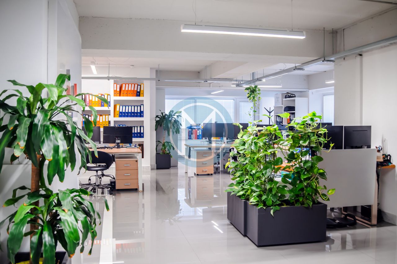
This is also an inclusion issue. Neurodivergent employees often struggle in overstimulating open plans. Providing alternative environments-noise‑reduced pods, visual screens, or chill corners-isn’t a luxury, it’s a retention strategy.
Noise, light, and air: your invisible productivity killers
You can’t see noise or CO₂ levels, but your brain can. Acoustic design, lighting, and air quality are often overlooked yet crucial levers of performance.
Some baseline numbers:
- Light level: 500–1000 lux for focused work
- Noise level: under 50 dB for knowledge work
- CO₂ concentration: below 1000 ppm to avoid fatigue
Yet many offices ignore these. I’ve audited spaces with gorgeous furniture but no ventilation, where afternoon error rates spiked 30%. Plants, operable windows, or even a modest HVAC upgrade often pay back in fewer sick days and higher output.
How colour, texture and materials actually influence your team
Colour psychology isn’t woo. Soft blues and greens can lower heart rate and improve sustained attention, making them ideal for open seating. Reds and oranges boost energy and risk‑taking-good for brainstorm rooms but exhausting in finance.
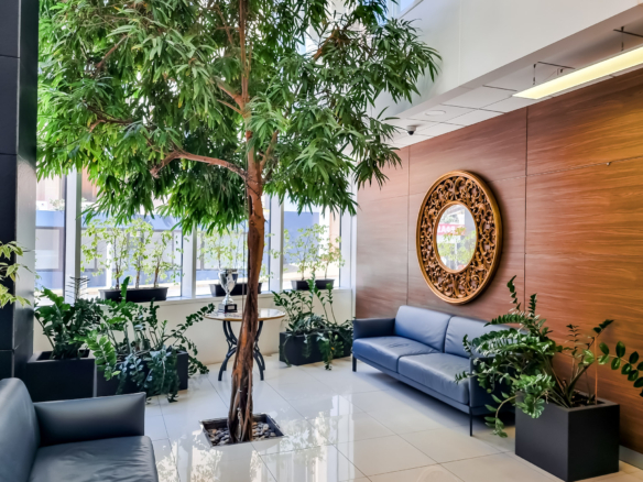
Materials matter too. Hard surfaces like glass and metal reflect sound and signal formality. Wood, cork and fabric absorb noise and feel warmer. Biophilic touches-living walls, stone textures-aren’t just pretty; they lower perceived stress.
In one client’s call centre, swapping white melamine dividers for cork panels cut echo and staff churn simultaneously. That’s a design decision paying HR dividends.
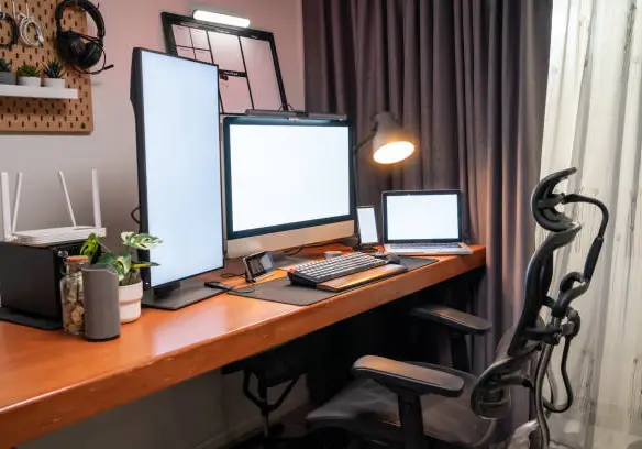
Ergonomics isn’t just about chairs-it’s about how people move
Most companies think ergonomics = adjustable chairs. But circulation-the way people move through space-is just as crucial. Borrow the urban‑planning concept of “desire lines”: the paths people naturally take.
If everyone cuts diagonally across the office to reach the kitchen, maybe your plan is wrong. That foot traffic can disturb ten desks an hour. Reposition amenities or use flooring textures to guide flow subtly.
Also, think vertically. Standing‑height counters near printers let people check emails while waiting without blocking hallways. It’s micro‑optimisation that adds up.
Small office? Here’s how to make every square metre count
Tiny doesn’t mean cramped. It just means strategic. Wall-mounted storage can double as acoustic dampers, while modular desks on casters allow you to flip between “training mode” and “production mode” in minutes.
One of my favourite tricks is vertical zoning: use shelving or plant screens to carve “rooms” without ever building walls. In a 45 m² start-up space I helped design, we created four distinct work zones plus a lounge using only mobile bookcases and colour cues.
The key is choosing the right kind of furniture. A desk system with a compact footprint, built-in cable management, and a modular design that adapts to different layouts will always outperform a fixed bench that locks you into one configuration forever.
Your office should evolve – design for change, not permanence
Business models pivot, teams grow, and hybrid schedules fluctuate. Yet many offices are still fitted out as if they’re frozen in time. Design for change instead.
Modular partitions, plug‑and‑play wiring, and furniture on wheels allow you to reconfigure at will. The difference between a “fit‑out” and a “fit‑flex” is that the latter treats change as inevitable. When your headcount jumps by 30% or you go hybrid, you won’t have to start from scratch.
Agility also saves money. Moving walls is cheaper than moving leases.
Should you DIY it, or hire a space planner? (And what to ask them)
Finally, execution. Should you sketch your own layout or bring in a professional?
DIY pros: lower cost, direct control, speed. Cons: blind spots, hidden compliance issues, poor acoustic outcomes.
Professional pros: data‑driven planning (occupancy sensors, daylight modelling), legal compliance, often better cost optimisation over time. Cons: upfront fees, less flexibility mid‑project.
If you do hire, ask sharper questions than “what’s your hourly rate?” For example:
- “How do you factor hybrid work into your plans?”
- “What’s your strategy for neurodivergent inclusion?”
- “Do you model noise propagation or just guess?”
I once consulted for a small law firm that DIY’d its move to save money. They placed filing cabinets along the only fire exit route. The fines alone cost more than a planner’s fee.
Key Takeaways Hidden in the Details
Across all these angles runs one theme: space is a living system. Every desk orientation, partition choice, colour palette, or air‑handling tweak is an input with measurable outputs-focus, speed, morale, retention.
Treat your office not as décor but as infrastructure. Build it like you’d build software: user‑centred, testable, and ready to iterate. That’s how layout stops being a cost centre and becomes a productivity engine.